


Discover important features of a responsive website design including flexible layouts, media queries, mobile optimization, and fast performance.

Important Features of a Responsive Website Design
In today’s digital landscape, users access websites through a wide variety of devices including smartphones, tablets, laptops, and desktop computers. Because of this diversity, businesses must ensure that their websites deliver a seamless experience across all screen sizes. Understanding the important features of a responsive website design is essential for building websites that adapt dynamically to different devices while maintaining usability, performance, and visual appeal.
Responsive web design allows a single website to automatically adjust its layout, images, typography, and navigation depending on the screen size and resolution of the user’s device. This approach eliminates the need for separate mobile and desktop websites while ensuring that users enjoy a consistent browsing experience.
Modern responsive websites are built using flexible grids, scalable images, media queries, and mobile-first design principles. These features ensure that content remains accessible, readable, and functional across all devices.
Whether you are launching a new website or redesigning an existing one, incorporating responsive design principles can significantly improve user engagement, search engine rankings, and conversion rates.
Why Important Features of a Responsive Website Design Are Important
Responsive website design plays a crucial role in modern digital experiences. With mobile traffic accounting for a significant portion of internet usage, businesses must ensure their websites function seamlessly across devices.
Key reasons why responsive design is important include:
Improved User Experience
Responsive websites provide consistent navigation and readability on all devices.Mobile Accessibility
Users can easily browse websites on smartphones and tablets without zooming or scrolling excessively.Better SEO Performance
Search engines prioritize mobile-friendly websites in search rankings.Higher Conversion Rates
Responsive websites make it easier for users to complete actions such as purchases or form submissions.Reduced Website Maintenance
A single responsive website eliminates the need for separate mobile versions.Future-Proof Design
Responsive websites adapt easily to new screen sizes and emerging devices.
By implementing responsive design features, businesses can ensure their websites remain accessible and effective across all platforms.
Types of Responsive Website Design Solutions
Responsive design can be implemented through various approaches depending on business requirements and development strategies.
Mobile-First Responsive Design
Designing websites primarily for mobile devices and scaling up for larger screens.Adaptive Web Design
Creating different layouts for specific screen sizes and devices.Fluid Grid Design
Using flexible layouts that adjust automatically based on screen dimensions.Responsive E-Commerce Design
Optimizing online stores for seamless shopping experiences across devices.Progressive Web Application (PWA) Design
Web applications that behave like mobile apps while remaining responsive.Responsive Landing Page Design
Marketing-focused pages optimized for conversions on all devices.
These responsive design solutions ensure that websites remain functional and visually appealing regardless of screen size.
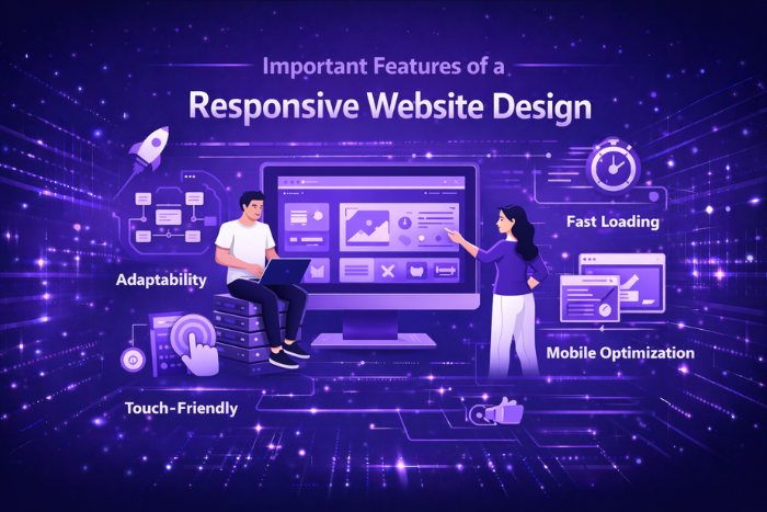
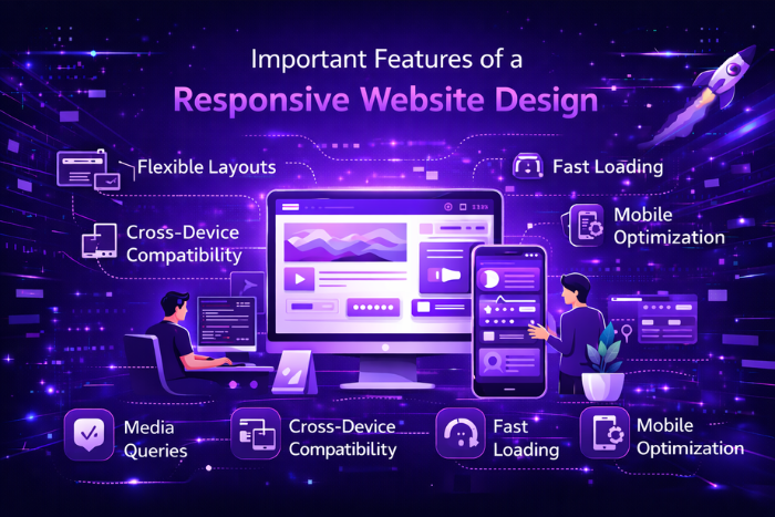
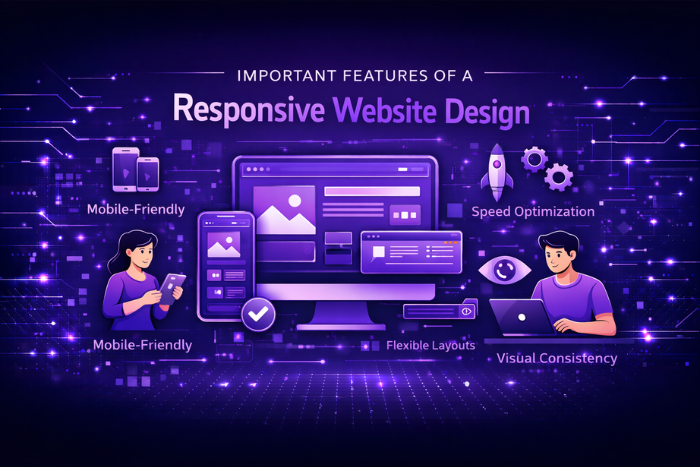
Key Features of a Responsive Website Design
Successful responsive website design includes several important features that ensure websites adapt smoothly across devices.
Flexible Grid Layouts
Layout structures that automatically adjust to different screen widths.Media Queries
CSS rules that allow websites to adapt styling based on device characteristics.Responsive Navigation Menus
Navigation systems that adjust for smaller screens using dropdowns or hamburger menus.Scalable Images and Media
Images and videos that resize automatically without losing quality.Responsive Typography
Text that adjusts size and spacing for better readability across devices.Mobile-Friendly Interactions
Buttons and interactive elements optimized for touch screens.Fast Loading Performance
Optimized assets and efficient coding improve website speed.Consistent User Experience
Ensuring similar functionality and usability across all devices.Cross-Browser Compatibility
Websites function consistently across different browsers and operating systems.
These features help create websites that are visually appealing, user-friendly, and technically robust.
Responsive Website Development Process
Creating a responsive website requires a structured development process that focuses on usability and performance.
Requirement Analysis and Planning
Identify target audiences, device preferences, and business goals.Wireframing and Responsive Layout Planning
Design flexible layouts that adapt to multiple screen sizes.Mobile-First Design Implementation
Build the design starting with mobile interfaces and scale up.Front-End Development
Implement responsive grids, media queries, and flexible components.Content and Media Optimization
Optimize images, videos, and text for multiple resolutions.Cross-Device Testing
Test the website across smartphones, tablets, laptops, and desktops.Performance Optimization
Improve loading speed and website responsiveness.Deployment and Continuous Monitoring
Launch the website and monitor performance across devices.
This development workflow ensures responsive websites deliver optimal performance and usability.
Technology Stack
Modern responsive websites rely on various technologies and frameworks that support flexible layouts and dynamic content.
Frontend Technologies: HTML5, CSS3, JavaScript
Responsive Frameworks: Bootstrap, Tailwind CSS, Foundation
Frontend Libraries: React.js, Vue.js, Angular
Design Tools: Figma, Adobe XD, Sketch
Testing Tools: BrowserStack, LambdaTest
Performance Tools: Google PageSpeed Insights, GTmetrix
CMS Platforms: WordPress, Shopify, Webflow
Using modern frameworks and development tools ensures responsive websites are scalable, efficient, and easy to maintain.
Cost Factors in Responsive Website Design
The cost of responsive website development varies depending on several project-related factors.
Website size and number of pages
Custom design and development complexity
Integration with third-party tools or platforms
E-commerce functionality requirements
Content creation and multimedia assets
Responsive testing across devices
Performance optimization and security setup
Maintenance and ongoing updates
Investing in responsive design ensures long-term usability and improved digital performance.
Latest Trends
Responsive design continues to evolve as new technologies and user behaviors shape digital experiences.
Key trends influencing responsive website design include:
Mobile-First Development
Designing websites primarily for mobile devices.Advanced CSS Layout Systems
Using CSS Grid and Flexbox for flexible layouts.Progressive Web Applications (PWAs)
Web experiences that behave like mobile applications.Adaptive Images and Media
Optimized visual assets that load efficiently on different devices.Voice Search Compatibility
Designing interfaces that support voice-based interactions.AI-Driven Personalization
Websites adapting content based on user preferences.Minimalist and Clean Design
Simplified layouts that enhance readability and usability.
These trends highlight how responsive design continues to evolve to meet modern user expectations.
Why Choose Us for Responsive Website Design Services?
Selecting the right development partner is crucial for building responsive websites that deliver exceptional user experiences. Our team specializes in designing modern, high-performing websites optimized for all devices.
Here’s why businesses choose our responsive website design services:
Mobile-First Design Expertise – Websites optimized for mobile users from the start.
User-Centered Design Approach – Interfaces designed to enhance usability and engagement.
SEO-Friendly Development – Responsive structures that improve search engine visibility.
Performance Optimization – Fast-loading websites that deliver smooth browsing experiences.
Scalable and Future-Ready Solutions – Websites designed to adapt to emerging devices and technologies.
Ongoing Support and Maintenance – Continuous updates and performance improvements.
Our team focuses on building responsive websites that not only look great but also perform efficiently across all platforms.
Ready to build a responsive website that delivers seamless user experiences on every device?
Let our experts design a modern, mobile-friendly website tailored to your business needs.
Contact us today for a free consultation and responsive website design quote.
Key Points :
- Responsive website design ensures websites adapt seamlessly to different devices such as smartphones, tablets, and desktops.
- Key features include flexible grid layouts, media queries, scalable images, and responsive typography.
- Mobile-friendly navigation and touch-optimized interactions improve usability on smaller screens.
- Fast loading speed and optimized performance enhance user experience and reduce bounce rates.
- Responsive design improves SEO performance since search engines prioritize mobile-friendly websites.
- Consistent user experience across devices helps increase engagement, conversions, and overall website effectiveness.
FAQ's
Key features include flexible layouts, media queries, responsive images, mobile-friendly navigation, and scalable typography.
Responsive design ensures websites function properly across different devices and screen sizes.
Responsive design adapts layouts to different screens, while mobile-first design begins with mobile layouts and scales upward.
Yes, search engines prioritize mobile-friendly websites, making responsive design beneficial for SEO.
Technologies include HTML5, CSS3, JavaScript, and frameworks such as Bootstrap and Tailwind CSS.
Media queries apply CSS styles based on device screen size, resolution, and orientation.
Responsive testing tools such as BrowserStack, Chrome DevTools, and mobile simulators can help evaluate responsiveness.
The timeline depends on project complexity but typically ranges from a few weeks to several months.