


Professional responsive web design services to create mobile-friendly, fast-loading, and SEO-optimized websites for all devices.
Responsive Web Design
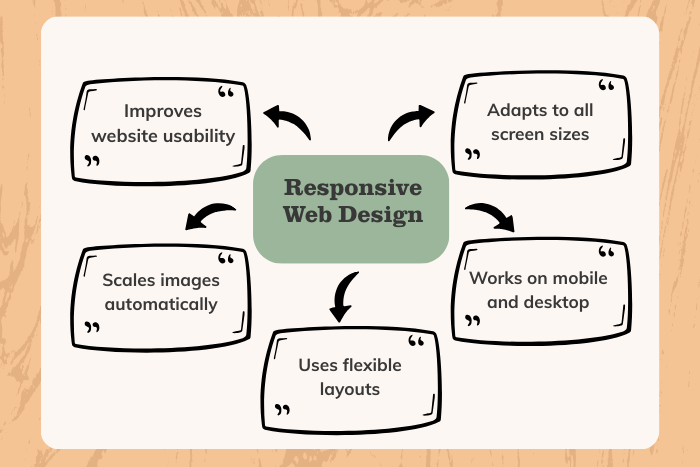
In today’s multi-device world, users access websites from smartphones, tablets, laptops, and large desktop screens. Responsive Web Design ensures your website automatically adapts to every screen size, delivering a seamless and consistent user experience. Without responsiveness, businesses risk losing traffic, engagement, and potential customers due to poor usability.
Our responsive web design services focus on building flexible, mobile-first websites that combine aesthetic appeal with technical precision. We use fluid grids, adaptive images, and modern CSS frameworks to create websites that look and function perfectly across all devices. Whether you’re launching a new website or optimizing an existing one, we ensure your platform performs flawlessly.
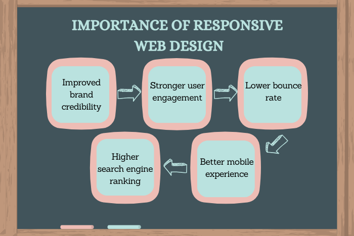
Beyond visual adaptability, responsive web design improves SEO rankings, enhances page speed, and boosts conversions. With a strategic and user-centered approach, we create digital experiences that not only adjust to screens but also drive measurable business growth.
Why Responsive Web Design Is Important
More than half of global web traffic comes from mobile devices. Search engines prioritize mobile-friendly websites in rankings, making responsive design essential for online visibility.
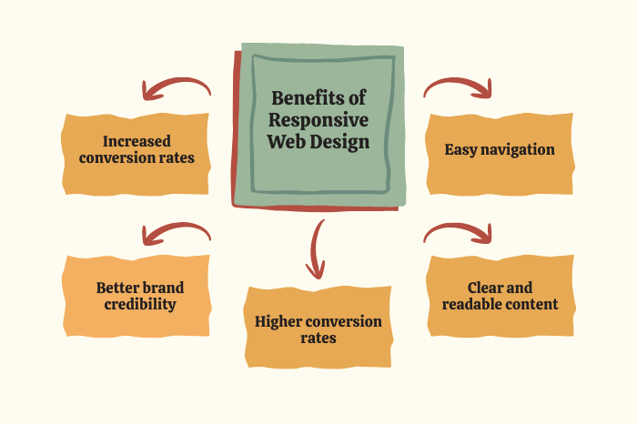
Investing in responsive web design helps you:
Deliver consistent user experience across devices
Improve mobile usability and navigation
Boost search engine rankings (mobile-first indexing)
Reduce bounce rates
Increase engagement and conversions
Simplify website management with a single codebase
Future-proof your website for emerging devices
A responsive website adapts dynamically to user behavior and screen size, ensuring optimal readability, accessibility, and functionality at all times.
Types of Responsive Web Design Solutions
We offer tailored responsive design solutions for various business needs:
Mobile-First Website Design
Designing for smaller screens first, then scaling up for larger devices.Responsive Website Redesign
Transforming non-responsive or outdated websites into mobile-friendly platforms.Responsive eCommerce Design
Online stores optimized for smooth shopping experiences across devices.Progressive Web App (PWA) Design
App-like responsive experiences with offline capabilities.Cross-Browser Compatibility Optimization
Ensuring consistent performance across Chrome, Safari, Edge, and Firefox.Landing Page Responsiveness
High-converting landing pages optimized for mobile campaigns.Responsive Web Application Interfaces
SaaS dashboards and portals that adapt to multiple screen sizes.Accessibility-Focused Responsive Design
WCAG-compliant layouts that enhance usability for all users.
Key Features of Our Responsive Web Design Services
Our responsive website design solutions are engineered for performance and flexibility.
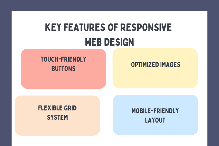
Fluid Grid Layouts
Flexible grid systems that scale proportionally across screen sizes.
Adaptive Images & Media
Optimized visuals that adjust without compromising speed or quality.
Mobile-Optimized Navigation
Intuitive menus and touch-friendly interactions.
Fast Loading Speeds
Image compression, lazy loading, and performance optimization.
SEO-Friendly Architecture
Clean code structure aligned with mobile-first indexing standards.
Cross-Device Testing
Rigorous testing across various devices and browsers.
Accessibility Compliance
Inclusive design that supports diverse users and assistive technologies.
Scalable Design Systems
Future-ready frameworks that evolve with technological advancements.
Our Responsive Web Design Process
We follow a structured and agile approach to ensure flawless delivery:
Discovery & Strategy Planning
Understanding user demographics, device usage, and business goals.Mobile-First Wireframing
Designing layouts optimized for smaller screens first.UI/UX Design & Prototyping
Creating interactive prototypes to validate usability.Responsive Development Implementation
Applying flexible grids, CSS media queries, and adaptive frameworks.Testing Across Devices
Verifying responsiveness on multiple devices and screen sizes.Performance Optimization
Enhancing speed, reducing load times, and optimizing assets.Deployment & Monitoring
Launching the website and tracking performance metrics.Ongoing Improvements
Continuous updates based on analytics and user feedback.
Technology Stack
We use modern tools and frameworks to deliver high-performance responsive websites.
Frontend Technologies:
HTML5, CSS3, JavaScript
Frameworks & Libraries:
Bootstrap, Tailwind CSS, React.js, Vue.js
Responsive Techniques:
CSS Media Queries, Flexbox, CSS Grid
Performance Tools:
Google Lighthouse, PageSpeed Insights
Testing Tools:
Cross-browser testing platforms, device emulators
CMS Platforms:
WordPress, Shopify, Drupal, Headless CMS
Cost Factors
The cost of responsive website design depends on several variables:
Existing website structure (if redesigning)
Number of pages and design complexity
Custom UI/UX requirements
eCommerce functionality
Interactive elements and animations
Cross-browser compatibility needs
Performance optimization depth
Timeline and project scope
We provide transparent pricing tailored to startups, SMEs, and enterprises.
Latest Trends in Responsive Web Design
Responsive design continues to evolve with new technologies and user expectations. Key trends include:
Mobile-first and thumb-friendly design
Adaptive typography and scalable fonts
Dark mode compatibility
Motion UI and micro-interactions
Progressive Web Apps (PWAs)
AI-driven personalization
Voice search optimization
Container queries and advanced CSS techniques
Performance-first development strategies
Accessibility-focused design standards
Integrating these trends ensures your website remains competitive and user-friendly.
Why Choose Our Responsive Web Design Services
Selecting the right partner ensures long-term digital success.
User-Centered Approach
We design experiences tailored to real user behavior and device usage.
Performance & SEO Focus
Optimized for speed, mobile-first indexing, and higher search rankings.
Modern Development Standards
Utilizing the latest responsive frameworks and CSS techniques.
Custom Solutions
No generic templates—every project is uniquely crafted.
Transparent Workflow
Clear communication, milestone tracking, and collaborative feedback.
Long-Term Support
Continuous monitoring and improvements post-launch.
Ready to make your website fully responsive and future-ready?
Contact us today for a free responsive web design consultation.
Let’s build a mobile-friendly website that delivers seamless performance across all devices.
Key Points :
- Responsive Web Design ensures websites adapt to all screen sizes, including mobile, tablet, and desktop.
- Responsive websites support better SEO rankings through mobile-first indexing and faster loading speed.
- Flexible layouts and scalable images create a smooth browsing experience across devices.
- Responsive Web Design increases engagement and conversion rates by simplifying navigation.
- Small businesses benefit from responsive websites by reaching more mobile users.
- Using one responsive website reduces maintenance costs and technical complexity.
- Investing in Responsive Web Design supports long-term business growth and online visibility.
FAQ's
Responsive web design is an approach that ensures websites adapt seamlessly to different screen sizes and devices.
Search engines use mobile-first indexing, meaning responsive websites rank higher due to improved usability and performance.
The timeline depends on project complexity. A standard website may take 4–6 weeks.
Yes. We offer responsive redesign services to upgrade non-mobile-friendly websites.
Yes. Optimized images and efficient coding improve performance across devices.
Yes. Responsive design adapts to all screen sizes, while mobile design focuses specifically on smartphones.
We use modern frameworks such as Bootstrap, Tailwind CSS, and CSS Grid.
Yes. We offer ongoing maintenance, monitoring, and performance optimization.