


Professional responsive website development services delivering fast, mobile-friendly, SEO-optimized websites for all devices.
Responsive Website Development
In today’s digital-first world, your website must perform flawlessly across smartphones, tablets, laptops, and desktops. Responsive Website Development ensures that your site automatically adapts to different screen sizes, providing a seamless user experience regardless of the device. With mobile traffic dominating global internet usage, businesses can no longer afford websites that look great on desktop but fail on smaller screens.
Our responsive web development services focus on performance, usability, and conversion optimization. We build mobile-friendly websites that load fast, rank well in search engines, and provide intuitive navigation. Whether you are a startup, small business, or enterprise, we create scalable and future-ready websites tailored to your business goals.
From flexible layouts and fluid grids to media queries and performance optimization, we use modern design principles and development frameworks to ensure your website stays competitive. If you’re looking to improve engagement, reduce bounce rates, and increase online visibility, responsive website development is the solution your business needs.
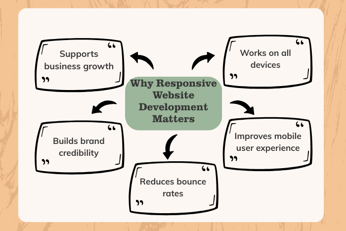
Why Responsive Website Development is Important
Responsive websites are no longer optional—they are essential for digital success.
1. Mobile-First User Experience
More than half of global web traffic comes from mobile devices. A responsive website ensures your content is easy to read and navigate on smaller screens.
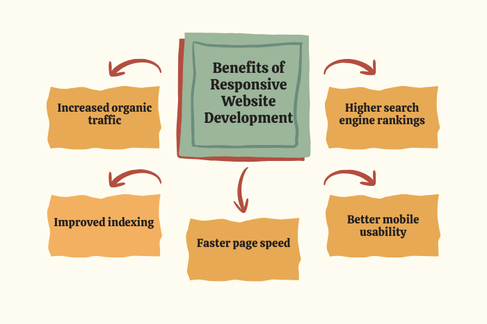
2. Improved SEO Rankings
Search engines prioritize mobile-friendly websites. Responsive website development helps improve search visibility and organic traffic.
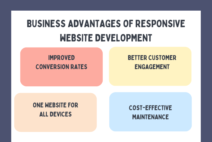
3. Higher Conversion Rates
When users can easily browse, fill forms, and complete purchases on any device, conversions increase significantly.
4. Cost-Effective Maintenance
Instead of managing separate desktop and mobile versions, a single responsive website reduces development and maintenance costs.
5. Faster Page Load Speed
Optimized responsive designs improve performance, reducing bounce rates and improving engagement.
Types of Solutions
We provide tailored responsive web development solutions to suit various business needs:
Corporate Responsive Websites – Professional websites for established businesses and enterprises.
Small Business Responsive Websites – Budget-friendly mobile-friendly websites designed for growth.
eCommerce Responsive Development – Online stores optimized for seamless shopping across devices.
Landing Page Optimization – High-converting responsive landing pages for marketing campaigns.
CMS-Based Responsive Websites – WordPress and custom CMS websites with mobile adaptability.
Web Application Responsive Design – Scalable responsive interfaces for SaaS platforms and web apps.
Each solution is designed with flexibility, performance, and scalability in mind.
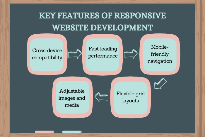
Key Features of Responsive Website Development
Our responsive website development services include:
Mobile-first design strategy
Fluid grid layouts
Flexible images and media
Media queries for adaptive display
Cross-browser compatibility
SEO-friendly structure
Optimized typography scaling
Touch-friendly navigation
Fast-loading optimized assets
Secure HTTPS implementation
Accessibility compliance
Scalable code architecture
We focus not only on design adaptability but also on speed, usability, and security.
Development Process
We follow a structured, results-driven approach:
1. Requirement Analysis
We understand your business goals, target audience, and technical needs.
2. Wireframing & Planning
Responsive wireframes are created to define layouts across devices.
3. UI/UX Design
We design adaptive user interfaces focusing on clarity, usability, and branding.
4. Development & Coding
Using modern frameworks and clean code practices, we build flexible and scalable layouts.
5. Testing Across Devices
We test across multiple screen sizes, browsers, and operating systems.
6. Performance Optimization
Images, scripts, and assets are optimized for speed and efficiency.
7. Launch & Ongoing Support
After deployment, we provide maintenance, updates, and performance monitoring.
Technology Stack for Responsive Website Development
We use modern technologies to build robust responsive websites:
Front-End Technologies:
HTML5, CSS3, JavaScript, React, Vue.js, Angular
Frameworks:
Bootstrap, Tailwind CSS, Foundation
Back-End Technologies:
Node.js, PHP, Python, .NET
CMS Platforms:
WordPress, Shopify, Drupal
Database:
MySQL, MongoDB, PostgreSQL
Cloud & Hosting:
AWS, Google Cloud, Azure
Our tech stack ensures scalability, security, and long-term performance.
Cost Factors of Responsive Website Development
The cost of responsive website solution depends on multiple factors:
Website size and complexity
Number of pages
Custom design requirements
eCommerce functionality
Third-party integrations
CMS customization
Content creation needs
Ongoing maintenance and support
A basic responsive website may cost less, while enterprise-level responsive web applications require advanced development and investment. We offer flexible pricing models to suit different business budgets.
Latest Trends
To stay competitive, we integrate modern responsive design trends:
Mobile-first development approach
Progressive Web Apps (PWA)
Dark mode compatibility
AI-powered personalization
Micro-interactions and animations
Voice search optimization
Core Web Vitals optimization
Minimalist and clean UI designs
Keeping up with these trends ensures your website remains modern and future-proof.
Why Choose Us for Responsive Website Development?
Choosing the right development partner makes all the difference.
Experienced responsive web developers
Mobile-first and SEO-focused approach
Custom, scalable solutions
Transparent pricing
On-time project delivery
Performance-optimized coding
Dedicated support team
Conversion-driven design strategy
We don’t just build responsive websites, we create digital platforms that drive measurable business growth.
Ready to make your website mobile-friendly and future-ready?
Let’s build a responsive website that performs flawlessly across all devices.
Contact us today for a free consultation and project estimate.
Key Points :
- Responsive Website Development ensures websites work smoothly on all devices, including smartphones, tablets, and desktops.
- Mobile-friendly design improves user experience, reducing bounce rates and increasing engagement.
- Search engines favor responsive websites, helping improve SEO rankings and online visibility.
- Mobile-first development approach enhances performance on smaller screens and future-proofs your website.
- Flexible layouts and media queries allow automatic screen adjustment, improving readability and navigation.
- Responsive Website Development reduces long-term maintenance costs, since only one website needs updates.
FAQ's
Responsive website development is the process of creating websites that automatically adapt to different screen sizes and devices.
Search engines prioritize mobile-friendly websites, improving rankings and visibility.
Depending on complexity, development can take anywhere from 2 to 8 weeks.
Yes, we can redesign and redevelop your current website to make it fully responsive.
Responsive design ensures adaptability across all devices, while mobile-friendly may only target smartphones.
Costs vary based on features, customization, and functionality requirements.
When properly optimized, responsive websites offer improved loading speeds and performance.
Yes, we ensure cross-browser compatibility for consistent user experience.